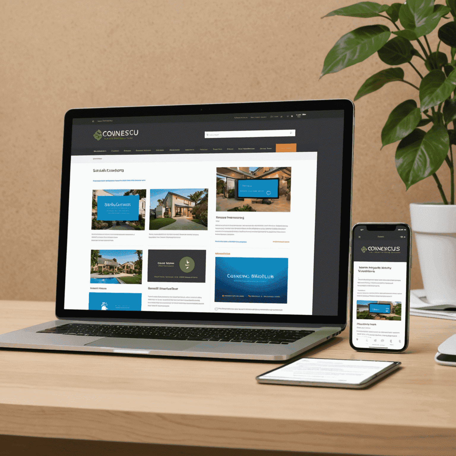
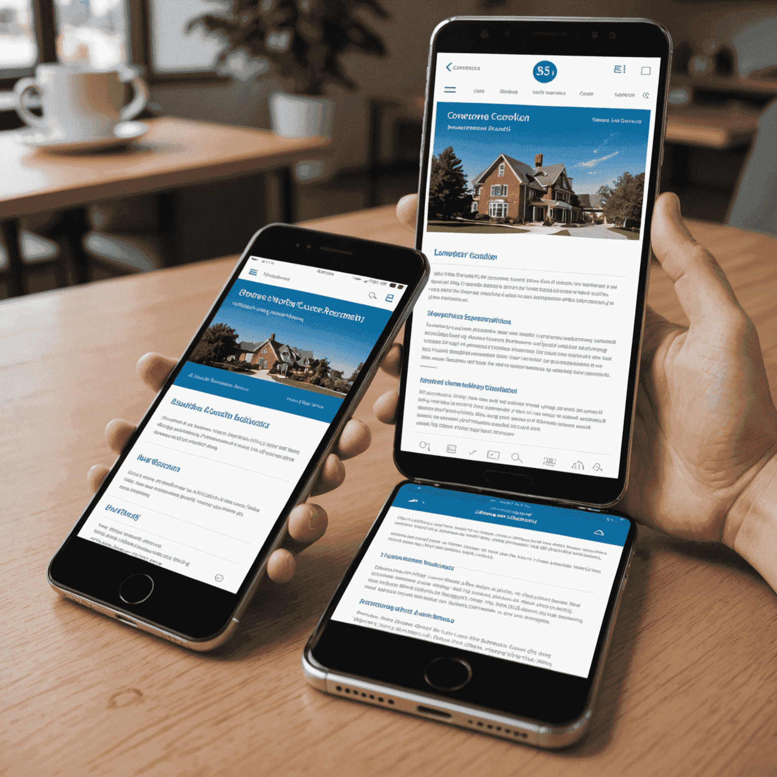
Responsive Design: Flawless Across All Devices
Our Mobile-First Approach
At CONNEXUSCU Web Design, we understand that in today's digital landscape, your website needs to look and function perfectly on every device. That's why we've adopted a mobile-first approach to ensure your online presence is always at its best, no matter the screen size.
Why Responsive Design Matters
- Improved user experience across all devices
- Higher search engine rankings
- Increased conversion rates and engagement
- Future-proof design for emerging technologies
Fluid Grids
Our designs use flexible, proportion-based grids that adapt to any screen size, ensuring your content always looks its best.
Flexible Images
Images automatically adjust to fit the available space, maintaining quality and preventing layout issues on smaller screens.
Media Queries
We use advanced CSS techniques to apply different styles based on device characteristics, optimizing the layout for each user.
Experience the Difference
Ready for a Website That Works Everywhere?
Let CONNEXUSCU Web Design create a responsive, mobile-first website that will impress your visitors and boost your online presence. Our fast, high-quality, and effective approach ensures your site will look great and perform flawlessly on every device.